DESIGN PRINCIPLES - TASK 3: DESIGN
Week 5 - Week 7 (04/03/24 - 22/03/24)
Azim Azariff Bin Azahar
Bachelor of Design (Honours) in Creative Media
Design Principles - Task 3: Design
INSTRUCTIONS
TASK 3: DESIGN
This task requires us to create a design based on our analysis in Project 2 whilst also implementing our knowledge of design principles into the design. We are allowed to use any sort of medium/material to create our design.
My idea for Project 3 is to create a minimal poster which conveys a message that represents my chosen goal: (1) No Poverty
These are some designs that I may implement onto my poster.
Visual References:
FEEDBACK
Week 5: I was absent during this class.
Week 6: Can't use pictures, must show some progress in the next class.
Week 7: Find a better hand pose, make the small hand image smaller and put it above the title, make the small hand image, replace the lines next to the title to something more symbolic.
Azim Azariff Bin Azahar
Bachelor of Design (Honours) in Creative Media
Design Principles - Task 3: Design
INSTRUCTIONS
<iframe
src="https://drive.google.com/file/d/1W5zFCZkKv0omqyvaBjAhzwsDkYFC3L1m/preview"
width="640" height="480" allow="autoplay"></iframe>
TASK 3: DESIGN
This task requires us to create a design based on our analysis in Project 2 whilst also implementing our knowledge of design principles into the design. We are allowed to use any sort of medium/material to create our design.
My idea for Project 3 is to create a minimal poster which conveys a message that represents my chosen goal: (1) No Poverty
These are some designs that I may implement onto my poster.
Visual References:
 |
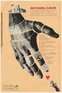
| Fig. 3.2 Our School Climate Posters (13/03/24) |
 |
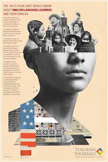
| Fig. 3.3 Countless kids worldwide suffer from destitution (13/03/24) |
 |
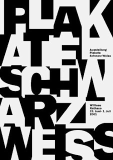
| Fig. 3.4 No Poverty (13/03/24) |
 |
| Fig. 3.5 Eradication of Poverty (20/03/24) |
Even though these are my visual reference, my poster may not end up looking like this.
My first idea was to create a poster by taking out subjects from photographs and create one nice poster with it, however, it turns out I'm not allowed to do that for this project. Due to this, I have to find a different way to create this poster.
My first idea was to create a poster by taking out subjects from photographs and create one nice poster with it, however, it turns out I'm not allowed to do that for this project. Due to this, I have to find a different way to create this poster.
Sketches:
Like I mentioned before, my idea is to create a minimal poster which conveys a message about my topic. Just like the chosen artwork from my first project, it will look simple.
After I sketched some ideas on paper, I decided to go on Adobe Illustrator to sketch out the main subjects from those sketches using the pen tool.
After receiving feedback, I sketched out new things to replace to my chosen poster.
Once I was done sketching, I decided to create a few posters before deciding on a final poster. The reason behind these sketches is that people need to help each other during tough times and come together as a community to prevent poverty from getting worse.
Possible Choices:
After creating three of these posters, I wanted to combine all of it and see how that would look like. This is the outcome:
As for now, my favourite one is the fourth poster as I mixed the other posters into one. Apart from it being a poster, it looks like it could be a book cover as well.
After receiving feedback from my lecturer, she told me to make some changes to the fourth poster.
Chosen Artwork:
Rationale:
My design is a minimal poster regarding the topic: (1) No Poverty. The reason why I designed the poster this way is because my goal for this poster was to make it minimal, just like the artwork I chose in the first project. As I wanted it to be minimal, all I needed in the poster was a title and a main subject; in this case, the two hands are the main subject. These two hands represent people helping each other which is what ending poverty is all about. Ending poverty is not just about giving people money, it is the fact that people are helping one another to prevent poverty from getting worse. Similar to my chosen artwork from the first project, this poster has a balance to it as the subject is not lopsided and that the title is center-aligned to the main subject. Other than that, the emphasis of the image is on the main subject as it takes most of the poster and it is the main focus of the poster.
Like I mentioned before, my idea is to create a minimal poster which conveys a message about my topic. Just like the chosen artwork from my first project, it will look simple.
 |
| Fig. 3.6 Physical sketch (20/03/24) |
 |
| Fig. 3.7 Physical sketch (20/03/24) |
After I sketched some ideas on paper, I decided to go on Adobe Illustrator to sketch out the main subjects from those sketches using the pen tool.
 |
| Fig. 3.8 Sketch using Pen tool (20/03/24) |
 |
| Fig. 3.9 Sketch using Pen tool (20/03/24) |
After receiving feedback, I sketched out new things to replace to my chosen poster.
 |
| Fig. 3.10 Sketch using Pen tool (22/03/24) |
 |
| Fig. 3.11 Sketch using Pen tool (22/03/24) |
 |
| Fig. 3.12 Sketch using Pen tool (22/03/24) |
Once I was done sketching, I decided to create a few posters before deciding on a final poster. The reason behind these sketches is that people need to help each other during tough times and come together as a community to prevent poverty from getting worse.
Possible Choices:
 |
| Fig. 3.13 Poster 1 (20/03/24) |
 |
| Fig. 3.14 Poster 2 (20/03/24) |
 |
| Fig. 3.15 Poster 3 (20/03/24) |
After creating three of these posters, I wanted to combine all of it and see how that would look like. This is the outcome:
 |
| Fig. 3.16 Poster 4 (20/03/24) |
As for now, my favourite one is the fourth poster as I mixed the other posters into one. Apart from it being a poster, it looks like it could be a book cover as well.
After receiving feedback from my lecturer, she told me to make some changes to the fourth poster.
Chosen Artwork:
.jpg) |
| Fig. 3.17 Eradicate Poverty (22/03/24) |
As you can tell, the poster has some new changes here and there. To be honest, it does look a lot better than it did before.
My design is a minimal poster regarding the topic: (1) No Poverty. The reason why I designed the poster this way is because my goal for this poster was to make it minimal, just like the artwork I chose in the first project. As I wanted it to be minimal, all I needed in the poster was a title and a main subject; in this case, the two hands are the main subject. These two hands represent people helping each other which is what ending poverty is all about. Ending poverty is not just about giving people money, it is the fact that people are helping one another to prevent poverty from getting worse. Similar to my chosen artwork from the first project, this poster has a balance to it as the subject is not lopsided and that the title is center-aligned to the main subject. Other than that, the emphasis of the image is on the main subject as it takes most of the poster and it is the main focus of the poster.
FEEDBACK
Week 5: I was absent during this class.
Week 6: Can't use pictures, must show some progress in the next class.
Week 7: Find a better hand pose, make the small hand image smaller and put it above the title, make the small hand image, replace the lines next to the title to something more symbolic.


Comments
Post a Comment