TYPOGRAPHY - TASK 1: EXERCISES
4th April 2023 - 2nd May 2023 (Week 1 - Week 5)
Azim Azariff Bin Azahar (0353583)
Bachelor of Design (Honours) in Creative Media
Typography - Task 1: Exercises
Image from Pinterest
LIST / JUMPLINKS:
-
LECTURES
-
Week 1
-
Week 2
-
Week 3
-
Week 4
-
Week 5
-
INSTRUCTIONS
-
PROJECTS
-
Exercise 1: Task 1
-
Exercise 1: Task 2
-
Exercise 2
-
FEEDBACK
-
FURTHER READING

- Week 1
- Week 2
- Week 3
- Week 4
- Week 5
- Exercise 1: Task 1
- Exercise 1: Task 2
- Exercise 2
LECTURES
Week 1 (04/04/23): Mr. Vinod discussed many things with the whole class as it was our first Typography class of the semester. He began to talk about what we should expect during these upcoming 14 weeks. Mr. Vinod told us about the Facebook group that we all have to join as this is where he would update us about anything. To be honest there were a lot of information to take in, however, Mr. Vinod managed to explain every single detail nicely for the class. Lastly, he told us about Blogger which was my first time hearing about it as it was my first semester. We basically have to blog everything we do. It's a new experience for me but hopefully I'll get used to it.
What I learned this week: Typo_1_Development
Typography Development / Timeline
1) Early letterform development: Phoenician to Roman
Direction of writing:
- Phoenician: Right to left
- Roman: Right to left and left to right alternatively (direction of reading changes = orientation of letterforms changes)

|
|
Fig. 1.1.1 Phoenician writing (20/04/23) |

|
|
Fig. 1.1.2 Boustrophedon (20/04/23) |
Etruscan carvers would paint letterforms over the marble
before carving.

|
|
Fig. 1.1.3 Carved Letters (20/04/23) |

|
|
Fig. 1.1.4 Evolution of letterforms (20/04/23) |
2) Hand script from 3rd - 10th century C.E.
Square capitals
- Developed around 4th - 5th century.
- It had serifs added to the finish of each main stroke.
- Pen held at an angle, around 60 degrees.
Square capitals
- Developed around 4th - 5th century.
- It had serifs added to the finish of each main stroke.
- Pen held at an angle, around 60 degrees.

|
|
Fig. 1.2.1 Square capitals (20/04/23) |
Rustic capitals
- Developed around late 3rd - mid 4th century.
- A compressed version of Square Capitals
- Took less time to write but it was harder to read due to compressed nature.
- Pen held at an angle, around 30 degrees.
- Developed around late 3rd - mid 4th century.
- A compressed version of Square Capitals
- Took less time to write but it was harder to read due to compressed nature.
- Pen held at an angle, around 30 degrees.

|
|
Fig. 1.2.2 Rustic capitals (20/04/23) |
Roman cursive
- Developed in the 4th century
- The beginning of what we call lowercase letterforms
- Used in everyday transactions
- Developed in the 4th century
- The beginning of what we call lowercase letterforms
- Used in everyday transactions

|
|
Fig. 1.2.3 Roman cursive (20/04/23) |
Uncials
- Developed around 4th - 5th century.
- 'Uncia' is Latin for a twelfth of anything.
- Some scholars think that Uncials refer to letters that are one inch high.
- Broad forms of Uncials are more readable at small sizes compared to Rustic Capitals.
Half-uncials
- Developed in C. 500
- The formal beginning of lowercase letterforms.
- 2000 years after the introduction to the Phoenician alphabet.
- Developed around 4th - 5th century.
- 'Uncia' is Latin for a twelfth of anything.
- Some scholars think that Uncials refer to letters that are one inch high.
- Broad forms of Uncials are more readable at small sizes compared to Rustic Capitals.

|
|
Fig. 1.2.4 Uncials (20/04/23) |
- Developed in C. 500
- The formal beginning of lowercase letterforms.
- 2000 years after the introduction to the Phoenician alphabet.

|
|
Fig. 1.2.5 Half-uncials (20/04/23) |
Caloline miniscule
- Developed in C. 925
- Charlemange chose the Alcuin of York, Abbot of St Martin of Tours to oversee the standardisation of the writing system.
- Alcuin of York introduced uppercase letters, lowercase letters, capitalisation in sentences and also punctuations.
- Other than to standardise, it was developed to help convey messages easily.
Blackletter (Textura)
- Developed in C. 1300.
- After the dissolution of Chalemange's empire, a letterform known as 'Blackletter' in Northern Europe gained popularity.
- There is a rounder version in the South called 'Rotunda'.
- Developed in C. 925
- Charlemange chose the Alcuin of York, Abbot of St Martin of Tours to oversee the standardisation of the writing system.
- Alcuin of York introduced uppercase letters, lowercase letters, capitalisation in sentences and also punctuations.
- Other than to standardise, it was developed to help convey messages easily.

|
|
Fig. 1.2.6 Caloline miniscule (20/04/23) |
3) Blackletter to Gutenberg's type
Blackletter (Textura)
- Developed in C. 1300.
- After the dissolution of Chalemange's empire, a letterform known as 'Blackletter' in Northern Europe gained popularity.
- There is a rounder version in the South called 'Rotunda'.
.png)
|
|
Fig. 1.3.1 Blackletter (Textura) (20/04/23) |
Gutenberg's type
- Developed in C. 1455
- Gutenberg was skilled in Engineering, Metalsmithing and Chemistry.
- Gutenberg invented printing from Blackletter.
- Developed in C. 1455
- Gutenberg was skilled in Engineering, Metalsmithing and Chemistry.
- Gutenberg invented printing from Blackletter.

|
|
Fig. 1.3.2 42 Line Bible, Johann Gutenberg,
Mainz (20/04/23) |

|
|
Fig. 1.3.3 The 42 line Bible (20/04/23) |
4) Text type classification
1450 Blackletter
- The earliest printing type
- Based upon the hand-copying styles that were used in Northern Europe.
Examples: Cloister Black / Goudy Text
1450 Blackletter
- The earliest printing type
- Based upon the hand-copying styles that were used in Northern Europe.
Examples: Cloister Black / Goudy Text

|
|
Fig. 1.4.1 1450 Blackletter (20/04/23) |
1475 Oldstyle
- Based upon the lowercase forms used by the Italian humanist scholars for book copying.
- Uppercase letterforms were based upon the words inscribed on Roman ruins.
Examples: Bembo / Caslon / Dante / Garamond / Janson / Jenson / Palatino
1500 Italic
- The first italics were close-set and condensed, allowing more words in a page.
- Originally considered as their own class of type, italics were soon changed to complement roman forms.
- Since the 16th century, all typefaces were designed with accompanying italic forms.
1550 Script
- Not appropriate in lengthy text settings.
- Only used in shorter applications.
Examples: Kuenstler Script / Snell Roundhand
- Based upon the lowercase forms used by the Italian humanist scholars for book copying.
- Uppercase letterforms were based upon the words inscribed on Roman ruins.
Examples: Bembo / Caslon / Dante / Garamond / Janson / Jenson / Palatino

|
|
Fig. 1.4.2 1475 Oldstyle (20/04/23) |
1500 Italic
- The first italics were close-set and condensed, allowing more words in a page.
- Originally considered as their own class of type, italics were soon changed to complement roman forms.
- Since the 16th century, all typefaces were designed with accompanying italic forms.

|
|
Fig. 1.4.3 1500 Italic (20/04/23) |
- Not appropriate in lengthy text settings.
- Only used in shorter applications.
Examples: Kuenstler Script / Snell Roundhand

|
|
Fig. 1.4.4 1550 Script (20/04/23) |
1750 Transitional
- A refinement of oldstyle forms.
Examples: Baskerville / Bulmer / Century / Times Roman
- A refinement of oldstyle forms.
Examples: Baskerville / Bulmer / Century / Times Roman

|
|
Fig. 1.4.5 1750 Traditional (20/04/23) |
1775 Modern
- Represents a rationalization of oldstyle letterforms.
- Serifs were unbracketed.
Examples: Bell / Bodoni / Caledonia / Didot / Welbaum
- Represents a rationalization of oldstyle letterforms.
- Serifs were unbracketed.
Examples: Bell / Bodoni / Caledonia / Didot / Welbaum

|
|
Fig. 1.4.6 1775 Modern (20.04.23) |
1825 Square Serif / Slab Serif
- Originally heavily bracketed serif.
- As they evolved, the brackets were dropped.
- These typefaces were used for heavy type in commercial printing.
Examples: Clarendon / Memphis / Rockwell / Serifa
1900 Sans Serif
- These typefaces eliminated serifs altogether.
- Its used only became wide-spread until the beginning of the twentieth century.
Example: Akzidenz Grotesk / Grotesk / Gili Sans / Franklin Gothic / Frutiger / Futura / Helvetica / Meta / News Gothic / Optima / Syntax / Trade Gothic / Univers
- Originally heavily bracketed serif.
- As they evolved, the brackets were dropped.
- These typefaces were used for heavy type in commercial printing.
Examples: Clarendon / Memphis / Rockwell / Serifa

|
|
Fig. 1.4.7 1825 Square Serif / Slab
Serif (20/04/23) |
1900 Sans Serif
- These typefaces eliminated serifs altogether.
- Its used only became wide-spread until the beginning of the twentieth century.
Example: Akzidenz Grotesk / Grotesk / Gili Sans / Franklin Gothic / Frutiger / Futura / Helvetica / Meta / News Gothic / Optima / Syntax / Trade Gothic / Univers
|
|
|
Fig. 1.4.8 1900 Sans Serif (20/04/23) |
1990 Serif/Sans Serif
- This style enlargers the notion of a family of typefaces to include both serif and sans serif alphabets.
Examples: Rotis / Scala / Stone
- This style enlargers the notion of a family of typefaces to include both serif and sans serif alphabets.
Examples: Rotis / Scala / Stone

|
|
Fig. 1.4.9 1990 Serif/Sans Serif (20/04/23) |
Week 2 (11/04/23): Mr. Vinod started the class by introducing himself. He mentioned the things he has done for work such as Photography, Graphic Design, Education and Writing. He showed us some of his past works and it was actually very impressive. He even told us about the books he has written and that we can purchase them in the Taylor's Library. Afterwards, Mr. Vinod went through some of the students' work that were sent in the Facebook group. There were many important things he said about the designs which gave me more ideas when creating these sketches.

|
|
Image from lecture slide (Week 2) (11/04/23) |
What I learned this week: Typo_2_Basic
1) Typography: Basic / Describing letterforms
Baseline
- The imaginary line the visual base of the letterforms.
Median
-The imaginary line defining the x-height of letterforms.
X-height
- The height of any typeface of the lowercase 'x'.

|
|
Fig. 2.1.1 Baseline / Median / X-height (21/04/23) |
Stroke
- Any line that defines the basic letterform.

|
|
Fig. 2.1.2 Stroke (21/04/23) |
Apex / Vertex
- The point created by joining two diagonal stems.

|
|
Fig. 2.1.3 Apex / Vertex (21/04/23) |
Arm
- Short strokes off the stem of the letterform, either horizontal, or inclined upward.
- Short strokes off the stem of the letterform, either horizontal, or inclined upward.

|
|
Fig. 2.1.4 Arm (21/04/23) |
Ascender
- The portion of the stem of a lowercase letterform that projects above the median.

|
|
Fig. 2.1.5 Ascender (21/04/23) |
Beak
- The half-serif finish on some horizontal arms.

|
|
Fig. 2.1.6 Beak (21/04/23) |
Bowl
- The rounded form that describes a counter. The bowl may be either open or closed.

|
|
Fig. 2.1.7 Bowl (21/04/23) |
Bracket
- The transition between the serif and the stem.
- The transition between the serif and the stem.

|
|
Fig. 2.1.8 Bracket (21/04/23) |
Cross Bar
- The horizontal stroke in a letterform that joins two stems together.
- The horizontal stroke in a letterform that joins two stems together.

|
|
Fig. 2.1.9 Cross Bar (21/04/23) |
Cross Stroke
- The horizontal stroke in a letterform that joins two stems together.

|
|
Fig. 2.1.10 Cross Stroke (21/04/23) |
Crotch
- The interior space where two strokes meet.

|
|
Fig. 2.1.11 Crotch (21/04/23) |
Descender
- The portion of the stem of a lowercase letterform that projects below the baseline.
- The portion of the stem of a lowercase letterform that projects below the baseline.

|
|
Fig. 2.1.12 Descender (21/04/23) |

|
|
Fig. 2.1.14 Em/en (21/04/23) |
Finial
- The rounded non-serif terminal to a stroke.

|
|
Fig. 2.1.15 Finial (21/04/23) |
Leg
- Short stroke off the stem of the letterform, either at the bottom of the stroke or inclined downward.

|
|
Fig. 2.1.16 Leg (21/04/23) |
Ligature
- The character formed by the combination of two or more letterforms.
- The character formed by the combination of two or more letterforms.

|
|
Fig. 2.1.17 Ligature (21/04/23) |
Link
- The stroke that connects the bowl and the loop of a lowercase G.
- The stroke that connects the bowl and the loop of a lowercase G.

|
|
Fig. 2.1.18 Link (21/04/23) |
Serif
- The right-angled or oblique foot at the end of the stroke.

|
|
Fig. 2.1.19 Serif (21/04/23) |
Spine
- The curved stem of the S.

|
|
Fig. 2.1.20 Spine (21/04/23) |
Stress
- The orientation of the letterform, indicated by the thin stroke in round forms.

|
|
Fig. 2.1.21 Stress (21/04/23) |
Swash
- The flourish that extends the stroke of the letterform.

|
|
Fig. 2.1.22 Swash (21/04/23) |
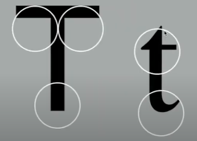
Terminal
- The self-contained finish of a stroke without a serif.
|
|
Fig. 2.1.23 Terminal (21/04/23) |
2) Typography:
Basic / The font
- Capital letters , including certain accented vowels.

|
|
Fig. 2.2.1 Uppercase (21/04/23) |
Lowercase
- Lowercase letters include the same characters as uppercase.

|
|
Fig. 2.2.2 Lowercase (21/04/23) |
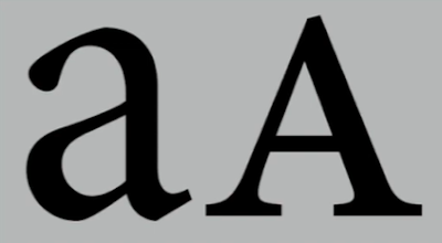
Small Capitals
- Uppercase letterforms draw to the x-height of the typeface.
- Small caps are primarily found in serif fonts as part of what is often called expert set.
Uppercase Numerals
- The numerals are the same height as uppercase letters and are all set to the same kerning width.
Lowercase Numerals
- Also known as old style figures or text figures.
- These numerals are set to x-height with ascenders and descenders.
- Best used whenever upper and lowercase letterforms are used.
Italic
- Most fonts today are produced with a matching italic.
- Small caps are almost always only roman.
Ornaments
- Used as flourishes in invitations or certificates.
- Usually provided as a font in a larger typeface family.
- Only a few traditional or classical typefaces contain ornamental fonts (Adobe Caslon Pro).
- Uppercase letterforms draw to the x-height of the typeface.
- Small caps are primarily found in serif fonts as part of what is often called expert set.

|
|
Fig. 2.2.3 Small Capitals (21/04/23) |
|
|
Fig. 2.2.4 Small Capitals (2) (21/04/23) |
Uppercase Numerals
- The numerals are the same height as uppercase letters and are all set to the same kerning width.

|
|
Fig. 2.2.5 Uppercase Numerals (21/04/23) |
Lowercase Numerals
- Also known as old style figures or text figures.
- These numerals are set to x-height with ascenders and descenders.
- Best used whenever upper and lowercase letterforms are used.

|
|
Fig. 2.2.6 Lowercase Numerals (21/04/23) |
Italic
- Most fonts today are produced with a matching italic.
- Small caps are almost always only roman.

|
|
Fig. 2.2.7 Italic (21/04/23) |
Italic vs Roman

|
|
Fig. 2.2.8 Italic vs Roman (21/04/23) |
Punctuation / Miscellaneous characters
- Miscellaneous can change from typeface to typeface.
- Miscellaneous can change from typeface to typeface.

|
|
Fig. 2.2.9 Punctuation / Miscellaneous Characters (21/04/23) |
Ornaments
- Used as flourishes in invitations or certificates.
- Usually provided as a font in a larger typeface family.
- Only a few traditional or classical typefaces contain ornamental fonts (Adobe Caslon Pro).

|
|
Fig. 2.2.10 Ornaments (21/04/23) |
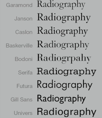
3) Typography: Basic / Describing typefaces
- The 10 typefaces below represent 500 years of type design.
- The two goals achieved when using these typefaces: Easy readability and an appropriate expression of contemporary esthetics.
|
|
Fig. 2.4.1 10 Typefaces (21/04/23) |
.png)
|
|
Fig. 2.4.2 10 Typefaces (2) (21/04/23) |
Week 3 (18/04/23): As it was the same week as 'Hari Raya'. Quite a number of people
could not attend physically so Mr. Vinod decided to conduct class
online on Zoom. It was quite an interactive Zoom session which is
surprising to me because usually the students would stay quiet
during Zoom calls, however, Mr. Vinod managed to make it somewhat
fun.
Most of the time, Mr. Vinod gave out feedbacks to most of the class regarding the first project. With all the feedbacks given, I gained extra knowledge and it helped me come up with ideas for my type expressions. My ideas are quite similar to other students but I did try to change it up a little.
Most of the time, Mr. Vinod gave out feedbacks to most of the class regarding the first project. With all the feedbacks given, I gained extra knowledge and it helped me come up with ideas for my type expressions. My ideas are quite similar to other students but I did try to change it up a little.
What I learned this week: Typo_3_Text_P1 & Typo_4_Text_P2
Typo_3_Text_P1
1) Typography: Text / Tracking: Kerning and Letterspacing
- The term 'Kerning' refers to the automatic adjustment of space between letters.
- 'Letterspacing' means to add space between the letters.
- 'Tracking' is the addition and removal of space in a word or sentence.
|
|
|
Fig. 3.1.2 Normal, loose and tight tracking (25/04/23) |
- Designers always letterspace uppercase letters.
- Uppercase letters are able to stand on their own, whereas, lowercase letters should maintain the line of reading.
- Should not letterspace lowercase letters as it breaks the counterform.

|
|
Fig. 3.1.3 Letterspacing lowercase letters (25/04/23) |
|
|
|
Fig. 3.1.4 Normal and Loose tracking (Lowercase) (25/04/23) |
|
|
|
Fig. 3.1.5 Tight tracking (Lowercase) (25/04/23) |
2) Typography: Text / Formatting Text
Flush left
- This format most closely mirrors the asymmetrical experience of handwriting.
- Spaces between words are consistent, allowing the type to create an even gray value.

|
|
Fig. 3.2.1 Flush left (25/04/23) |
Centered
- This format imposes symmetry upon the text.
- It transforms fields of texts into shapes.
- As centered type creates a strong shape to the page, it is important to amend line breaks so the texts do not appear jagged.

|
|
Fig. 3.2.2 Centered (25/04/23) |
Flush right
- This format places emphasis on the end of the line as opposed to its start.
- It can useful in situations such as captions.
Justified
- Like centering, this text imposes a symmetrical shape on the text.
- Achieved by expanding or reducing shapes between words and sometimes between letters.
- The resulting openness of lines can occasionally produce 'Rivers' of white space running vertically through the text.
- Extra attention to line breaks and hyphenation to amend these problems.
- This format places emphasis on the end of the line as opposed to its start.
- It can useful in situations such as captions.

|
|
Fig. 3.2.3 Flush right (25/04/23) |
Justified
- Like centering, this text imposes a symmetrical shape on the text.
- Achieved by expanding or reducing shapes between words and sometimes between letters.
- The resulting openness of lines can occasionally produce 'Rivers' of white space running vertically through the text.
- Extra attention to line breaks and hyphenation to amend these problems.

|
|
Fig. 3.2.4 Justified (25/04/23) |
- Designers tend to set type one way or another depending upon several factors.
- Typographer's first job: clear, appropriate presentation of the author's message.
- If you see the type before you see the words, change the type.

|
|
Fig. 3.2.5 Two different examples of invitations (25/04/23) |
3) Typography: Text / Texture
- Different typefaces suit different messages.
- It is important to know how different typefaces feel as text.
- Type with a relatively generous x-height or relatively heavy stroke width produces a darker mass on the page than type with a relatively smaller x-height or lighter stroke.

|
|
Fig. 3.3.1 Anatomy of a typeface (25/04/23) |

|
|
Fig. 3.3.2 Examples of textures with different fonts (1) (25/04/23) |

|
|
Fig. 3.3.3 Example of textures with different fonts (2) (25/04/23) |
4) Typography: Text / Leading and Line Length
The goal in setting text type is to allow for easy, prolonged reading.
Type size
- Text type should be large enough to read easily at arms length.
Leading
- Text that is set too highly encourages vertical eye movement.
- type that is set too loosely crates striped patterns that distract the reader from the material at hand.
Line length
- Appropriate leading for text is as much as a function of the line length as it is a question of type size and leading.
- Shorter lines requires less leading.
- Longers lines requires more leading.
- Keep line length between 55-65 characters.

|
|
Fig. 3.4.1 Bad examples of leading (25/04/23) |

|
|
Fig. 3.4.2 Different leadings (25/04/23) |
5) Typography: Text / Type specimen book
- A type specimen book shows samples of typefaces in various different sizes.
- A type specimen book is to provide an accurate reference for type, type size, type leading, type line length etc.

|
|
Fig. 3.5.1 Sample type specimen sheet (25/04/23) |
Composition requirement
- Text should create a field that can occupy a page or a screen.
- Ideal text should have a middle gray value, not a series of stripes.
- Text should create a field that can occupy a page or a screen.
- Ideal text should have a middle gray value, not a series of stripes.

|
|
Fig. 3.5.2 Composition (25/04/23) |
- It is useful to enlarge type to 400% on the screen to get a clear
sense of the relationship between descenders on one line and
ascenders on the line below.
Typo_4_Text_P2
'A' head
Week 4 (25/04/23): For this week I was not able to attend to class or even properly
listen to the Zoom class. This is because I was still celebrating
Raya.

|
|
Fig. 3.5.3 (25/04/23) |
Typo_4_Text_P2
6) Typography: Text / Indicating Paragraphs
The 'Pilcrow' (¶)
- A holdover from medieval manuscripts seldom use today.
'Line space'
- Ensures cross alignment across columns of text.
7) Typography: Text / Widows and Orphans
- A holdover from medieval manuscripts seldom use today.

|
|
Fig. 3.6.1 Pilcrow (25/04/23) |
'Line space'
- Ensures cross alignment across columns of text.

|
|
Fig. 3.6.2 Line space (25/04/23) |

|
|
Fig. 3.6.3 Line space vs Leading (25/04/23) |
Standard indentation
- The indent is the same size of the line spacing or the same size as the point size of your text.
- Should use 'justified' alignment.
- The indent is the same size of the line spacing or the same size as the point size of your text.
- Should use 'justified' alignment.

|
|
Fig. 3.6.4 Indentation (25/04/23) |
Extended paragraphs
- Creates unusually wide column of text.
- Can be strong compositional or functional reasons for choosing it.
- Creates unusually wide column of text.
- Can be strong compositional or functional reasons for choosing it.

|
|
Fig. 3.6.5 Extended paragraphs (25/04/23) |
7) Typography: Text / Widows and Orphans
- A widow is a short line of type left alone at the end of a
column of text.
- An orphan is a short line of type left alone at the start of a new column.
- Avoid creating 'Orphan'
- An orphan is a short line of type left alone at the start of a new column.
- Avoid creating 'Orphan'

|
|
Fig. 3.7.1 Widow and Orphan (25/04/23) |
- In justified texts, both widow and orphan are considered
serious gaffes.
- Flush right and ragged left text are more forgiving towards widows.
- Only solution to widows is to re-break your line endings throughout your paragraphs.
8) Typography: Text / Highlighting Text
- Flush right and ragged left text are more forgiving towards widows.
- Only solution to widows is to re-break your line endings throughout your paragraphs.
8) Typography: Text / Highlighting Text
Different kinds of emphasis require different kinds of
contrast.
- Sans Serif fonts usually are look larger.
- Should reduce point size by .5 if font is changed to Sans Serif.

|
|
Fig. 3.8.1 Highlight text within a column of text (25/04/23) |

|
|
Fig. 3.8.2 Highlight text within a column of text
(2) (25/04/23) |
- Sans Serif fonts usually are look larger.
- Should reduce point size by .5 if font is changed to Sans Serif.

|
|
Fig. 3.8.3 Sans Serif font (Univers) (25/04/23) |

|
|
Fig. 3.8.4 Reduced aligned figures by .5 (25/04/23) |
- When placing a field of colour behind a text, maintain the
left reading axis to ensure readability.

|
|
Fig. 3.8.5 Field of colour behind text (25/04/23) |
- Sometimes it is necessary to place certain typographic
elements outside of the margin as it maintains the reading
axis.
- Indented qoute outside and inside margin.

|
|
Fig. 3.8.6 Typographic elements outside margin (25/04/23) |
- Indented qoute outside and inside margin.

|
|
Fig. 3.8.7 Qoutes in/out of the margin (25/04/23) |
9) Typography: Text / Headline within Text
'A' head
- A head indicates a clear break between the topics
within a section.
'B' head
- B heads indicate a new supporting argument or example for the topic at hand.
- They do not disturb the text as strongly as A heads do.
- Shown in small caps, italic, bold serif and bold san serif.

|
|
Fig. 3.9.1 'A' head (25/04/23) |
'B' head
- B heads indicate a new supporting argument or example for the topic at hand.
- They do not disturb the text as strongly as A heads do.
- Shown in small caps, italic, bold serif and bold san serif.

|
|
Fig. 3.9.2 'B' head (25/04/23) |
'C' head
- C heads are not common but it does highlights specific facets of material within B head text.
- They do not materially interrupt the flow of reading.
- Also shown in small caps, italic, bold serif and bold san serif.
Hierarchy
- Putting together a sequence of subheads = hierarchy.
- C heads are not common but it does highlights specific facets of material within B head text.
- They do not materially interrupt the flow of reading.
- Also shown in small caps, italic, bold serif and bold san serif.

|
|
Fig. 3.9.3 'C' head (25/04/23) |
Hierarchy
- Putting together a sequence of subheads = hierarchy.

|
|
Fig. 3.9.4 Hierarchy (25/04/23) |
10) Typography: Text / Cross Alignment
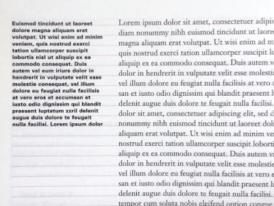
- Cross aligning headlines and captions with a text type
reinforces the architectural sense of the page, the structure,
while articulating the complimentary vertical rhythms.
- One line of headline type cross-aligns with two lines of text type, and four lines of headline type cross-align with five lines of text type.
|
|
Fig. 3.9.5 Cross aligning headlines and captions (25/04/23) |
- One line of headline type cross-aligns with two lines of text type, and four lines of headline type cross-align with five lines of text type.

|
|
Fig. 3.9.6 Cross align (25/04/23) |
What I learned this week: Typo_5_Understanding
1) Typography: Letters / Understanding Letterforms
- The uppercase letterforms below suggest symmetry.
- It is easy to see the two different stroke weights of the Baskerville stroke form.
- Each bracket connecting the serif to the stem has a unique arc.

|
|
Fig. 4.1.1 Baskerville form (28/04/23) |
- The width of the left slope is thinner than the right stroke
(below).
- Both Baskerville (above) and Univers (below) demonstrate the meticulous care a type designer takes to create letterforms that are both internally harmonious and individually expressive.
- Both Baskerville (above) and Univers (below) demonstrate the meticulous care a type designer takes to create letterforms that are both internally harmonious and individually expressive.

|
|
Fig. 4.1.2 Univers form (28/04/23) |
- The complexity of each individual letterform is neatly
demonstrated by examining the lowercase 'a' of two different
typefaces: Helvetica and Univers.
- The stems of the letterforms finish and how the bowls meet the stems quickly reveals the palphable difference in character between the two.
- The stems of the letterforms finish and how the bowls meet the stems quickly reveals the palphable difference in character between the two.

|
|
Fig. 4.1.3 Helvetica and Univers (28/04/23) |

|
|
Fig. 4.1.4 Helvetica and Univers overlapped (28/04/23) |
2) Typography: Letters / Maintaining X-height
- The x-height generally describe the size of the lowercase letterforms.
- Curved strokes, such as 's', must rise above the median in order to appear to be the same size as the vertical and horizontal strokes they adjoin.

|
|
Fig. 4.2.1 Curved strokes above the median (28/04/23) |

|
|
Fig. 4.2.2 Curved strokes (28/04/23) |
3) Typography: Letters / Form / Counterform
- Developing a sensitivity to the counterform - the space describes, and often contained, by the strokes of the form.
- When letterforms are joined to form words, counterform includes the spaces between them.
- How well you handle the counters when you set type determines how well the words hang together.

|
|
Fig. 4.3.1 Example of counterforms (28/04/23) |
- One of the most rewarding way to understand the form and
counter of a letter is to examine them close in detail.
- The examinations provide a good feel for how the balance between the form and counter is achieved.
- It also gives you a glimpse into the process of letter-making.
- The sense of the 'S' holds at each stage of enlargement, while the 'g' tends to lose its identity.
- The examinations provide a good feel for how the balance between the form and counter is achieved.
- It also gives you a glimpse into the process of letter-making.
- The sense of the 'S' holds at each stage of enlargement, while the 'g' tends to lose its identity.

|
|
Fig. 4.3.2 Examinations of 'S' and 'g' (28/04/23) |
4) Typography: Letters / Contrast
- The basic principles of Graphic Design apply directly to Typography.
- The simple contrasts produces numerous variations: small+organic/large+machined; small+dark/large light

|
|
Fig. 4.4.1 Contrasts (28/04/23) |

|
|
Fig. 4.4.2 Different Contrasts (28/04/23) |
Week 5 (02/05/23): In this week's class, Mr. Vinod went through some of the text
formatting work that we have done so far. Other than that, he
gave us a brief on the second project.
What I learned this week: Typo_6_Screen&Print
1) Typography / Different Medium
- In the past, once a publication was edited, typeset and printed, it was done. Nothing changes after that.
What I learned this week: Typo_6_Screen&Print
1) Typography / Different Medium
- In the past, once a publication was edited, typeset and printed, it was done. Nothing changes after that.
Print type VS Screen type
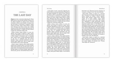
Type for print
Caslon, Garamond, Baskerville are the most common typefaces for print as they are highly readable when set at a small font size.
|
|
Fig. 5.1.1 Print type (02/05/23) |
Type for screen
Typefaces intended for use on the web are optimised and often modified to enhance readability and performance onscreen in a variety of digital environments.
Typefaces intended for use on the web are optimised and often modified to enhance readability and performance onscreen in a variety of digital environments.
Hyperactive link / Hyperlink
A hyperlink is a word, phrase or image that you can click on to jump to a new document or new section within the same document. Text hyperlinks are normally blue and underlined by default.
Font size for screen
16-pixel text on a screen is about the same size as text printed in a book or magazine.
Web safe fonts
Open Sans, Lato, Arial, Helvetica, Times New Roman, Times, Courier New, Courier, Verdana, Georgia, Palatino, Garamond
INSTRUCTIONS
<iframe
src="https://drive.google.com/file/d/1jaONs84hYEkPoGakuJEI0yBZZdhBLwEN/preview"
width="640" height="480" allow="autoplay"></iframe>
PROJECTS
Exercise 1: Type Expression
Week 1
In our first class, Mr. Vinod gave us 7 words to choose from. We needed to choose 4 out of the 7 words. Those words were: Rain, Fire, Crush, Water, Dissipate, Freedom and Sick. Apart from that, we were told to download 10 fonts that were given and we will be using these 10 fonts for the whole semester.
For this exercise, we basically have to create expressions for all 4 words which gives off the meaning of the word - without using much graphical elements.

|
|
Fig. 1.5.1 A few sketches (08/04/23) |

|
|
Fig. 1.5.2 A few more sketches (08/04/23) |
Week 2
In the end, I chose the words: Dissipate, Crush, Water and Freedom.

|
|
Fig. 2.5.1 Digitalised sketches (17/04/23) |

|
|
Fig. 2.5.2 Digitalised sketches (19/04/23) |
Week 3
<iframe
src="https://drive.google.com/file/d/1EbKj13ydfw64fUya4pmAEdpi1Iyro07u/preview"
width="640" height="480"
allow="autoplay"></iframe>
Exercise 1: Type Expression - Task 2
Week 3
After completing task 1, we need to choose one word out of the 4 to create an animated expression. Before choosing a word, I decided to try out creating GIFs using some of the words. The words I practiced on were Freedom and Crush.
Before creating the GIFs, I watched the 'Typo_Ex Type Expression Animation - Basic' tutorial from Mr. Vinod on Youtube.

|
|
Fig. 3.11.1 Youtube Tutorial (21/04/23) |
Week 4
A few days after watching the tutorial, I finally tried it out on the words I've chosen.
Crush (Version 1)
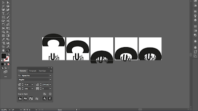
The first word is 'Crush'. As my first ever GIF, I actually quite like it. It may not have many things going on but it does represent the word pretty well.
This is the process of creating the GIF:
Crush (Version 2)
This is the second attempt of creating a GIF from the word 'Crush'. Instead of the letter 'C' falling from the top, I adjusted it to the side. The 'C' looks like it's coming from the side which looks pretty cool to me.
This is the process of creating the GIF:
Freedom (Version 1)
A few days after watching the tutorial, I finally tried it out on the words I've chosen.
Crush (Version 1)
The first word is 'Crush'. As my first ever GIF, I actually quite like it. It may not have many things going on but it does represent the word pretty well.
This is the process of creating the GIF:
|
|
Fig. 4.5.1 Process of 'Crush' GIF (27/04/23) |
The final outcome of the GIF:

|
|
Fig. 4.5.2 First 'Crush' GIF (27/04/23) |
Crush (Version 2)
This is the second attempt of creating a GIF from the word 'Crush'. Instead of the letter 'C' falling from the top, I adjusted it to the side. The 'C' looks like it's coming from the side which looks pretty cool to me.
This is the process of creating the GIF:

|
|
Fig. 4.5.3 Process of creating 'Crush' GIF
(2) (28/04/23) |
Freedom (Version 1)
The second word I tried it on is 'Freedom'. The letters
of the word starts off separated and it slowly comes
closer. Once the letters are close to each other, I
wanted to have the 'Freedom' effect with the letter 'M'
moving away from the rest of the word.
This is the process of creating the GIF:
This is the process of creating the GIF:

|
|
Fig. 4.5.5 Process of 'Freedom' GIF (27/04/23) |
The final outcome of the GIF:

|
|
Fig. 4.5.6 First 'Freedom' GIF (27/04/23) |
Freedom (Version 2)
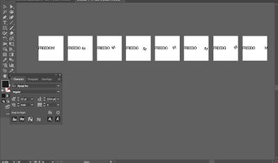
This is my second attempt at making a GIF from this word. It's a much simpler GIF than the first one.
This is the process of creating the GIF:
Exercise 2: Text
FormattingThis is my second attempt at making a GIF from this word. It's a much simpler GIF than the first one.
This is the process of creating the GIF:
|
|
Fig. 4.5.7 Process of creating 'Freedom' GIF
(2) (27/04/23) |
Week 4
Text formatting is the second exercise for task 1. Before beginning the exercise, we were instructed by Mr. Vinod to watch the Youtube videos that are related for this exercise. The videos are basically a guide for the exercise. We can either attempt the exercise whilst watching the videos or after completing the videos.
Week 5
Typo_Ex Text Formatting 1:4
Kerning & Tracking (Letter spacing)
In the first video, Mr. Vinod talks about 'Kerning & Tracking'. He gives us a detailed tutorial on what kerning & tracking is. In the video, he reminds us that the typefaces we need to use are the 10 typefaces that he has given us from the start. For the exercise, he uses his own name as an example and at the end of the video, he told us to try it out with our own name.
So this is my attempt at the exercise:
|
|
|
Fig. 5.2.1 Kerning & Tracking (01/04/23) |
Typo_Ex Text Formatting 2:4
Font size, Line length, Leading & Paragraph
spacingIn the second video, Mr. Vinod thought us about font size, line length, leading and paragraph spacing. After following the second video, this is my attempt.

|
|
Fig. 5.3.1 Process (01/04/23) |

|
|
Fig. 5.3.2 Process (01/04/23) |
Typo_Ex Text Formatting 3:4
Alignment, Paragraph spacing, Text fields &
RaggingAfter watching second video, I created a few layouts and tried different alignments. I also tried spacing some of the lines so it doesn't look ragging.
- Should only use left-aligned, left-justified or justified.

|
|
Fig. 5.4.1 Layout 1 (Left-aligned) (02/05/23) |

|
|
Fig. 5.4.2 Layout 2 (Left-justified) (02/05/23) |

|
|
Fig. 5.4.3 Layout 2 (Left-aligned) (02/05/23) |

|
|
Fig. 5.4.4 Layout 3 (Left-justified) (02/05/23) |
Typo_Ex Text Formatting 4:4
Cross Alignment & Baseline grid
After watching this video, these are my attempts at different layouts with small changes.
Cross Alignment & Baseline grid
After watching this video, these are my attempts at different layouts with small changes.

|
|
Fig. 5.5.1 Layout attempt 1 (03/05/23) |

|
|
Fig. 5.5.2 Layout attempt 2 (03/05/23) |

|
|
Fig. 5.5.3 Layout attempt 3 (03/05/23) |

|
|
Fig. 5.5.4 Layout attempt 4 (03/05/23) |

|
|
Fig. 5.5.5 Layout attempt 5 (03/05/23) |
FINAL DESIGN

|
|
Fig. 5.6.1 Final design (03/05/23) |
FINAL DIGITIZATION
<iframe
src="https://drive.google.com/file/d/1YwmYwu2LkysApFklAT2j0l8Ck3smwwSh/preview"
width="640" height="480"
allow="autoplay"></iframe>
Font: Futura Std
Typeface: Futura Std (Book)
Font size: 40pt, 11pt, 12pt
Leading: 13pt
Paragraph spacing: 13pt
Alignment: Left-justified
FINAL DESIGN WITH GRIDS
Typeface: Futura Std (Book)
Font size: 40pt, 11pt, 12pt
Leading: 13pt
Paragraph spacing: 13pt
Alignment: Left-justified
FINAL DESIGN WITH GRIDS
<iframe
src="https://drive.google.com/file/d/1elhP0G0PGIhODCgWnf8V3A1CUQ67H-fy/preview"
width="640" height="480"
allow="autoplay"></iframe>
Week 1 (04/04/23)
General Feedback: No feedback given as there was no work to show.
Specific Feedback: No feedback given as there was no work to show.
Week 2 (11/04/23)
General Feedback: Sketch using the 10 fonts Mr. Vinod has given. Sketch using hand and not digitally. When digitalising, make sure to use the 10 fonts given and make the design similar to the sketches. Not exactly the same as it will have distortion.
Specific Feedback: Should not use much water design as it creates distortion. Use little to no graphical elements.
Week 3 (18/04/23)
General Feedback: Avoid graphical elements, should avoid distortions, keep in mind of composition, use fonts that are suitable for the words.
Specific Feedback: Should use as much of the given box, allowed to move around letters as long as it is understandable.
Week 4 (25/04/23)
General Feedback: I was absent with permission so I was not able to receive any feedback.
Specific Feedback: I was absent with permission so I was not able to receive any feedback.
Week 5 (02/05/23)
General Feedback: Leading should not be too tight as it makes the texts look dark. Always place the most important thing first. Italicisation is not okay.
Specific Feedback: Futura Std has long ascenders so should increase leading.
REFLECTION
Experience:
It has been an interesting few weeks. The first two weeks was quite challenging for me because I have never worked with Adobe so I needed to get used to all the shortcuts and what not. I would say that working with Adobe Illustrator and InDesign has been really fun to be honest. Other than the software, I learned a lot about Typography. Even though the lectures on Youtube can be boring, it is filled with knowledge. I have developed few skills throughout these 5-6 weeks.
Observations:
When Mr. Vinod was giving feedback to the class, I was able to observe other people's works which helped me gain ideas throughout the process. It's interesting to see how everyone thinks differently to create designs, however in some cases, people can think similarly and create similar designs.
Findings:
Throughout these 5-6 weeks, I have realised that I actually really like digital design. I compared myself now to the time I took Foundation in Design and I noticed how stressful it was for me doing physical projects back then. Now, I actually have more motivation to do my work as it is digital. Apart from that, I've learned many things throughout such as the history of Typography and how to use Illustrator and InDesign. For me, learning new skills is really important and I'm glad I was able to do so.
FURTHER READINGGeneral Feedback: Avoid graphical elements, should avoid distortions, keep in mind of composition, use fonts that are suitable for the words.
Specific Feedback: Should use as much of the given box, allowed to move around letters as long as it is understandable.
Week 4 (25/04/23)
General Feedback: I was absent with permission so I was not able to receive any feedback.
Specific Feedback: I was absent with permission so I was not able to receive any feedback.
Week 5 (02/05/23)
General Feedback: Leading should not be too tight as it makes the texts look dark. Always place the most important thing first. Italicisation is not okay.
Specific Feedback: Futura Std has long ascenders so should increase leading.
REFLECTION
Experience:
It has been an interesting few weeks. The first two weeks was quite challenging for me because I have never worked with Adobe so I needed to get used to all the shortcuts and what not. I would say that working with Adobe Illustrator and InDesign has been really fun to be honest. Other than the software, I learned a lot about Typography. Even though the lectures on Youtube can be boring, it is filled with knowledge. I have developed few skills throughout these 5-6 weeks.
Observations:
When Mr. Vinod was giving feedback to the class, I was able to observe other people's works which helped me gain ideas throughout the process. It's interesting to see how everyone thinks differently to create designs, however in some cases, people can think similarly and create similar designs.
Findings:
Throughout these 5-6 weeks, I have realised that I actually really like digital design. I compared myself now to the time I took Foundation in Design and I noticed how stressful it was for me doing physical projects back then. Now, I actually have more motivation to do my work as it is digital. Apart from that, I've learned many things throughout such as the history of Typography and how to use Illustrator and InDesign. For me, learning new skills is really important and I'm glad I was able to do so.

|
| Source: https://m2.material.io/design/typography/understanding-typography.html |
Summary: This website was basically a introduction to typography. It explains all of the things that you need to know, especially for Typography class. However, you can already get all of the information from the website on the Youtube playlist Mr. Vinod provided.

|
| Source: https://www.youtube.com/watch?v=5Z3ZQmFM9LM |
Summary: This Youtube video was helpful for exercise 2. Watching the video made me realise that using grids in InDesign is actually very helpful when creating different layouts. This video also gave me some ideas for the exercise.

|
| Source: https://www.youtube.com/watch?v=xic_5zduz1A |
Summary: A very quick introduction to Typography. I decided to watch this video because I would rather watch a short introduction than a lone one. Whilst giving a brief introduction, there were several examples of designs throughout the video. If you're the type of person that does not have a long attention span, this video is for you.
LIST/JUMP LINKS


-01.jpg)


Comments
Post a Comment