ADVANCED TYPOGRAPHY - TASK 3: TYPE EXPLORATION & APPLICATION
1st November - 29th November (Week 10 - Week 14)
Azim Azariff Bin Azahar (0353583)Bachelor of Design (Honours) in Creative Media
Advanced Typography - Task 3: Type Exploration & Application
INSTRUCTIONS
<iframe
src="https://drive.google.com/file/d/1nwtOsgV5EgAT8B33Qlu0sdFH8eibi_8x/preview"
width="640" height="480" allow="autoplay"></iframe>
PROJECTS
Task 3: Type Exploration & Application
With the knowledge and experience gained in the exercises and tasks, with the accumulated knowledge from the lectures and your own reading (library books and online sources), with the experience gained in the different software covered in the programme thus far, synthesise and apply the learning in the tasks to be mentioned. Allow the knowledge gained to guide and inform your decisions for the effective execution of your final task.
Create a font that is intended to solve a larger problem or meant to be part of a solution in the area of your interest be it graphic design, animation, new media or entertainment design or any other related area not necessarily reflecting your specialisation. End result: a complete generated font (.ttf) with applications.
I decided to continue my font from my first assignment. After deciding that, we had to think of a purpose of our font creation.
My font
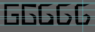
My font is based on marble art. Marble creates movement/rhythm and when you read the words using the font, it will look like it's flowing. However, I want to go against the popularised marble look and give marble a different meaning. I followed the lines of the marble to create dynamic and express the marble lining in different ways.
Purpose
Font to be used in graphic design posters, specifically towards architectural posters. Other than that, I would like to use the font for the architecture proposal/portfolio titles.
Once I was done with this, I began to complete the font.
Uppercase Letters
Basically I would use the font 'Myriad Pro' as my reference font. Then I would use the pen tool to create a marble looking letter. I did this for the whole font.
Final Uppercase Letters
Lowercase Letters
Similarly to the uppercase letters, I used 'Myriad Pro' as the reference font and used the pen tool.
Final Lowercase Letters
Numbers
I used the same technique as I did with uppercase and lowercase.
Final Numbers
Punctuations
Lowercase Letters
FontLab
Once I was done creating the fonts in Adobe Illustrator, I moved onto FontLab to make an official font.
After putting the letters into FontLab, I began to do some adjusting on the glyphs. Mr. Vinod told us to use the guide he sent to adjust the lettering.
I began to adjust the letters whilst looking at the guide.
Uppercase Letters
Lowercase Letters
Task 3: Type Exploration & Application
With the knowledge and experience gained in the exercises and tasks, with the accumulated knowledge from the lectures and your own reading (library books and online sources), with the experience gained in the different software covered in the programme thus far, synthesise and apply the learning in the tasks to be mentioned. Allow the knowledge gained to guide and inform your decisions for the effective execution of your final task.
Create a font that is intended to solve a larger problem or meant to be part of a solution in the area of your interest be it graphic design, animation, new media or entertainment design or any other related area not necessarily reflecting your specialisation. End result: a complete generated font (.ttf) with applications.
I decided to continue my font from my first assignment. After deciding that, we had to think of a purpose of our font creation.
My font
My font is based on marble art. Marble creates movement/rhythm and when you read the words using the font, it will look like it's flowing. However, I want to go against the popularised marble look and give marble a different meaning. I followed the lines of the marble to create dynamic and express the marble lining in different ways.
Purpose
Font to be used in graphic design posters, specifically towards architectural posters. Other than that, I would like to use the font for the architecture proposal/portfolio titles.
Once I was done with this, I began to complete the font.
Uppercase Letters

|
|
Fig. 1.1 Process of creating letters
(05/11/23) |

|
|
Fig. 1.2 Process (2)
(05/11/23) |

|
|
Fig. 1.3 Process (3)
(05/11/23) |

|
|
Fig. 1.4 Process (4)
(05/11/23) |
Basically I would use the font 'Myriad Pro' as my reference font. Then I would use the pen tool to create a marble looking letter. I did this for the whole font.
Final Uppercase Letters

|
|
Fig. 1.5 Final uppercase
(05/11/23) |

|
|
Fig. 1.6 Outline view
(05/11/23) |
Lowercase Letters
|
|
|
Fig. 2.1 Process of lowercase
(10/11/23) |
|
|
|
Fig. 2.2 Process (2)
(10/11/23) |
|
|
|
Fig. 2.3 Process (3)
(10/11/23) |
|
|
|
Fig. 2.4 Process (4) (10/11/23) |

|
|
Fig. 2.5 Process (5)
(10/11/23) |
Similarly to the uppercase letters, I used 'Myriad Pro' as the reference font and used the pen tool.
Final Lowercase Letters

|
|
Fig. 2.6 Final Lowercase
(10/11/23) |

|
|
Fig. 2.7 Outline View
(10/11/23) |
Numbers
|
|
|
Fig. 3.1 Process of numbers
(15/11/23) |

|
|
Fig. 3.2 Process (2)
(15/11/23) |

|
|
Fig. 3.3 Process (3)
(15/11/23) |
I used the same technique as I did with uppercase and lowercase.
Final Numbers

|
|
Fig. 3.4 Final Numbers
(15/11/23) |

|
|
Fig. 3.5 Outline view
(15/11/23) |
Punctuations
|
|
|
Fig. 4.1 Process of punctuations
(20/11/23) |

|
|
Fig. 4.2 Process (2)
(20/11/23) |

|
|
Fig. 4.3 Process (3)
(20/11/23) |
Lowercase Letters
<iframe
src="https://drive.google.com/file/d/1fVDItgsHhiuO-YPU6Wk5c7cc4DPfRPZQ/preview"
width="640" height="480" allow="autoplay"></iframe>
Numbers
<iframe
src="https://drive.google.com/file/d/1AECHASM7IDEETTFj4ARkwBqFaK7Eq1gy/preview"
width="640" height="480" allow="autoplay"></iframe>
Punctuations
<iframe
src="https://drive.google.com/file/d/1fRU6ZKTL4JyWCQ86SbNj3fOh4DUaUI1o/preview"
width="640" height="480" allow="autoplay"></iframe>
FontLab
Once I was done creating the fonts in Adobe Illustrator, I moved onto FontLab to make an official font.

|
|
Fig. 5.1 FontLab
(22/11/23) |
After putting the letters into FontLab, I began to do some adjusting on the glyphs. Mr. Vinod told us to use the guide he sent to adjust the lettering.

|
|
Fig. 5.2 Uppercase Guide (1)
(22/11/23) |

|
|
Fig. 5.3 Lowercase Guide (2)
(22/11/23) |
I began to adjust the letters whilst looking at the guide.
Uppercase Letters

|
|
Fig. 5.4 FontLab (1)
(23/11/23) |
|
|
|
Fig. 5.5 Uppercase side bearings
(23/11/23) |

|
|
Fig. 5.6 FontLab (2)
(23/11/23) |

|
|
Fig. 5.7 FontLab (3)
(24/11/23) |
|
|
|
Fig. 5.8 Lowercase side bearings (24/11/23) |
Once I was done adjusting, I downloaded the font.
Application
This was the second part of the assignment. After completing the creation of the font, we needed to create font presentations and font applications to showcase our font.
Font Presentations
Honestly, at first I wasn't really keen on these presentations, however, after getting second opinions, I started to like it even more. I then began on the application section.
Font Applications
So based on my purpose, I presented my fonts on architecture portfolios and an architecture graphic design poster.
Final PDFs
Font Presentation
FINAL SUBMISSIONS
1. MarbleElegance
Font Link: https://drive.google.com/drive/folders/1VTOrYPa7nmPKtxDVSF3FVvQVAdNR6H-b?usp=drive_link
2. Font Presentations
3. Font Applications
FEEDBACK
Week 10
General Feedback: Be specific. Answer questions like why and what.
Specific Feedback: Have a reason why I want to use my task 1 font. Look at MIB and come up with a reason from there
Week 11
General Feedback: Lowercase letters such as p and q need to be below x axis.
Specific Feedback: Lowercase letters such as p and q need to be below x axis.
Week 12
General Feedback: Finish up font and add on FontLab.
Specific Feedback: Make sure to adjust glyphs at 45 degrees in FontLab.
Week 13
General Feedback: ABSENT
Specific Feedback: ABSENT
FURTHER READING
Source: https://www.youtube.com/watch?v=1dWsDSmnyrM

|
|
Fig. 5.9 Downloading the font
(24/11/23) |
Application
This was the second part of the assignment. After completing the creation of the font, we needed to create font presentations and font applications to showcase our font.
Font Presentations

|
|
Fig. 6.1 Font presentation (1)
(25/11/23) |

|
|
Fig. 6.2 Font presentation (2)
(25/11/23) |

|
|
Fig. 6.3 Font presentation (3)
(25/11/23) |

|
|
Fig. 6.4 Font presentation (4)
(25/11/23) |
Honestly, at first I wasn't really keen on these presentations, however, after getting second opinions, I started to like it even more. I then began on the application section.
Font Applications

|
|
Fig. 6.5 Font application (1)
(25/11/23) |

|
|
Fig. 6.6 Font application (2)
(25/11/23) |

|
|
Fig. 6.7 Font application (3)
(25/11/23) |

|
|
Fig. 6.8 Font application (4)
(25/11/23) |
So based on my purpose, I presented my fonts on architecture portfolios and an architecture graphic design poster.
Final PDFs
Font Presentation
<iframe
src="https://drive.google.com/file/d/1i3ug4tvp14_Nt3PFnlEFCEaxymTYQjZF/preview"
width="640" height="480" allow="autoplay"></iframe>
Font Application
<iframe
src="https://drive.google.com/file/d/16U4zbdDmgUlELJ7i35MvxWZ2qYdrcmBf/preview"
width="640" height="480" allow="autoplay"></iframe>
FINAL SUBMISSIONS
1. MarbleElegance
Font Link: https://drive.google.com/drive/folders/1VTOrYPa7nmPKtxDVSF3FVvQVAdNR6H-b?usp=drive_link
2. Font Presentations

|
| Fig. 7.1 Font Presentation 1 |

|
| Fig. 7.2 Font Presentation 2 |

|
| Fig. 7.3 Font Presentation 3 |

|
| Fig. 7.4 Font Presentation 4 |
3. Font Applications

|
| Fig. 8.1 Font Application 1 |

|
| Fig. 8.2 Font Application 2 |

|
| Fig. 8.3 Font Application 3 |

|
| Fig. 8.4 Font Application 4 |
FEEDBACK
Week 10
General Feedback: Be specific. Answer questions like why and what.
Specific Feedback: Have a reason why I want to use my task 1 font. Look at MIB and come up with a reason from there
Week 11
General Feedback: Lowercase letters such as p and q need to be below x axis.
Specific Feedback: Lowercase letters such as p and q need to be below x axis.
Week 12
General Feedback: Finish up font and add on FontLab.
Specific Feedback: Make sure to adjust glyphs at 45 degrees in FontLab.
Week 13
General Feedback: ABSENT
Specific Feedback: ABSENT
FURTHER READING
 |
| Fig. 9.1 Mr. Vinod's FontLab demo |
I watched this video to help remind myself on how to use FontLab before doing mine. It's been a while since I've used FontLab so I needed to watch this beforehand.
 |
| Fig. 9.2 Youtube video |
Source: https://www.youtube.com/watch?v=1dWsDSmnyrM
I watched this video before creating my font just so I know the different ways on how to start making me font.
REFLECTION
Experience:
I didn't really enjoy doing this task in the beginning because there was so much to do. I had the mindset of "Wow there is so much to do in such a short period of time. I can't do this whilst doing other assignments". However, after a while, I managed to get that mindset out and just do the work. It excited me knowing that this was the last assignment for Advanced Typography. I felt many different emotions doing this task. It was just a lot to do, it wasn't that hard in the end.
Observations:
I didn't really observe my fellow classmates' work as I usually do, however, I needed some ideas for the presentations and applications so I went on Pinterest to look at some ideas. In the end, it helped me a lot and I managed to continue my work.
Findings:
After doing this task, I realised that creating fonts isn't hard at all. It's actually sorta fun to do. It just takes a lot of your time since there's a lot of letters and punctuations. But seeing your creation in the end, being able to download it and use it in different softwares, it's a good sight to see.


Comments
Post a Comment