Posts

Showing posts from May, 2023

DIGITAL PHOTOGRAPHY AND IMAGING - WEEK 5
Image
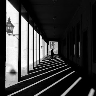
1st May 2023 (Week 5) Azim Azariff Bin Azahar (0353583) Bachelor of Design (Honours) in Creative Media Digital Photography and Imaging - Week 5 (Project 1B - Part 1) Image from Pinterest LECTURE Week 5 (01/05/23): There was no class as there was 'Labour Day' holiday. Replacement class in Week 6 (08/05/23) Digital Photography 1) Exposure Setting - In photography, exposure is the amount of light which reacher your camera sensor or film. Fig. 5.1.1 Exposure (08/05/23) Fig. 5.1.2 Parts of a camera (08/05/23) - IRIS, SHUTTER SPEED and ISO  - Shutter speed and aperture affect the a

TYPOGRAPHY - TASK 2: TYPOGRAPHIC EXPLORATION & COMMUNICATION (TEXT FORMATTING & EXPRESSION)

Image
9th May 2023 - 28th May 2023 (Week 6 - Week 8) Azim Azariff Bin Azahar (0353583) Bachelor of Design (Honours) in Creative Media Typography - Task 2: Typographic Exploration & Communication (Text Formatting & Expression) Image from printmag.com LECTURES Refer to Task 1. INSTRUCTIONS <iframe src="https://drive.google.com/file/d/1jaONs84hYEkPoGakuJEI0yBZZdhBLwEN/preview" width="640" height="480" allow="autoplay"></iframe> TASKS Task 2: Typographic Exploration & Communication  We are given 3 texts by Mr. Vinod and we must choose 1 out of the 3 to express it typographically.  We must do it in a 2-page editorial spread (200mm x 200mm) per page. Also, no images are allowed. Week 6 Before beginning on the task, I decided to watch the video tutorial on the Youtube playlist Mr. Vinod provided. Afterwards, I downloaded the editorial texts on Facebook. I brief

DIGITAL PHOTOGRAPHY AND IMAGING - WEEK 4

Image
24th April 2023 (Week 4) Azim Azariff Bin Azahar (0353583) Bachelor of Design (Honours) in Creative Media Digital Photography and Imaging - Week 4 (Project 1A - Part 2) Image from Pinterest LECTURE Week 4 (24/04/23):  There was no class as there was a public holiday for Raya celebration. Replacement class in Week 6 (08/05/23) Introduction to Photoshop 3: Adjustment Layer and Filters What is Adjustment Layer? - Adjustment layers are a group of super useful, non-destructive image editing tools that add colour and tonal adjustments to the image. - You can edit and discard your adjustments or restore your original image at any time. Fig. 4.1.1 Adjustment layer (15/05/23) Basic understanding of Adjustment Layer - A new layer will appear over the image when a

DIGITAL PHOTOGRAPHY AND IMAGING - WEEK 3

Image
17th April 2023 (Week 3) Azim Azariff Bin Azahar (0353583) Bachelor of Design (Honours) in Creative Media Digital Photography and Imaging - Week 3 (Project 1A - Part 2) Image from Pinterest LECTURE Week 3 (17/04/23):   In our third lecture, the class showed Mr. Fauzi our physical collage (Project 1A) before the class started. Afterwards, Mr. Fauzi finally introduced us to Adobe Photoshop before we begin our Project 1B. Basically we're going to be doing the same thing as the first project, however, the pictures are given and it is digital. We're going to work with Adobe Photoshop and create a college using the photos given. Introduction to Photoshop 2 1) Lasso Tool - The Lasso Tool allows you to draw and pinpoint specific areas of a document. - It is better to use the Lasso Tool with a graphic tablet as it is similar as a pencil.

DIGITAL PHOTOGRAPHY AND IMAGING - WEEK 2

Image
10th April 2023 (Week 2) Azim Azariff Bin Azahar (0353583) Bachelor of Design (Honours) in Creative Media Digital Photography and Imaging - Week 2 (Project 1A) Image from Pinterest LECTURE Week 2 (10/04/23): In this lecture, Mr. Fauzi talked about the key factors when creating a collage such as the focal point, composition, white spaces, etc. Mr. Fauzi showed us a few examples of good collages to help us understand better. Introduction to basic composition 1) Focal Point - Helps viewers eyes naturally settle on the important pieces of the design. 2) Scale & Hierarchy - Scale is often used to help communicate hierarchy by drawing attention toward and away from certain elements. 3) Balance the elements - Think of each element as having a 'weight' to it and this will help mastering asymmetrical balance. 4) White Space - It is to balance up the main focus of the composition. - Helps to balance out the busy parts of the design. - It helps the desi